
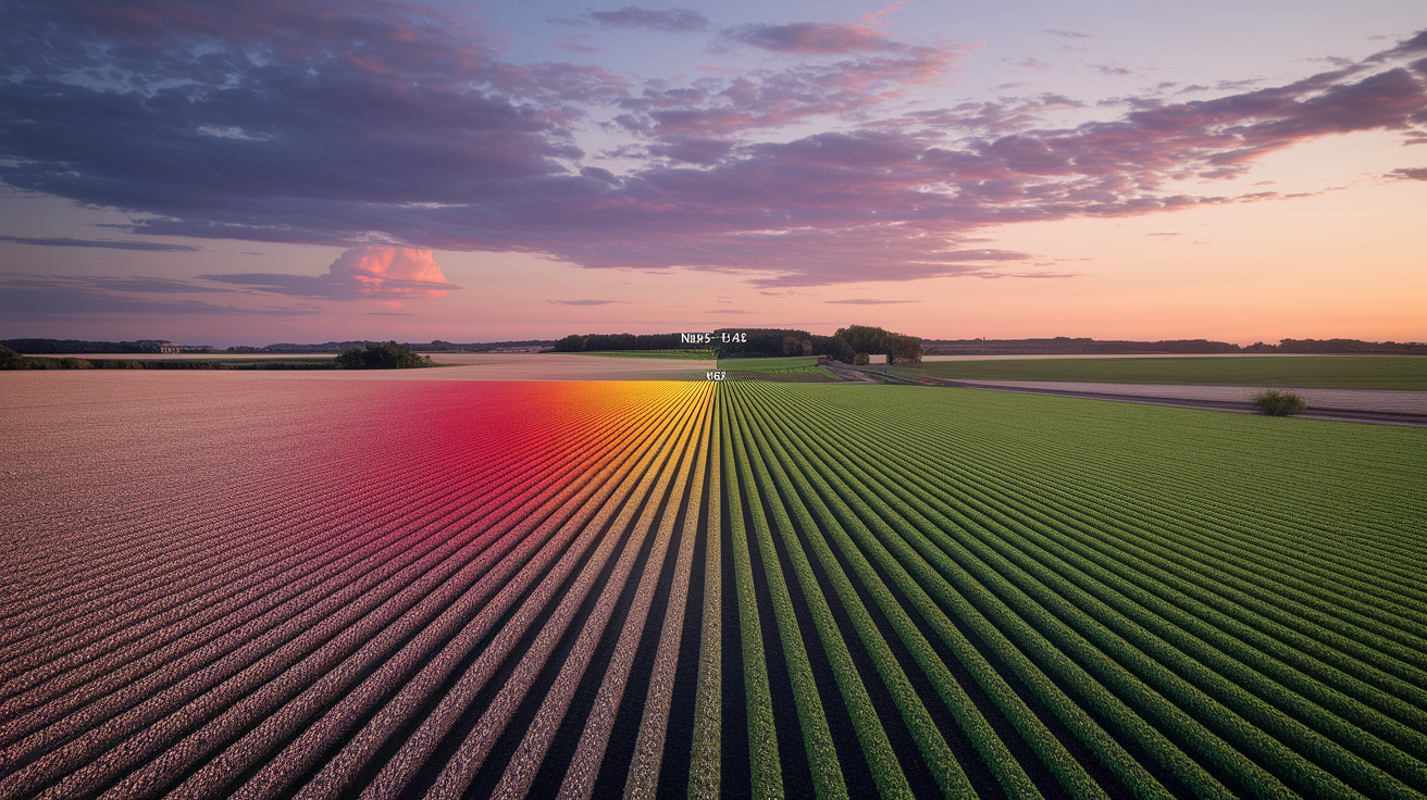
False-color images can trick you.
Red isn’t always what you think.
They map near-infrared light (NIR) into visible colors so healthy plants glow bright red.
When that red fades to pink, brown, or cyan, it often signals stress, like drought, pests, waterlogging, or nutrient problems.
This post shows you how to read those color shifts and the numbers behind them.
You’ll learn the right band combos, how NDVI thresholds flag trouble, and simple field checks to confirm what the map is telling you.
Core Principles for Interpreting False-Color Imagery to Detect Vegetation Stress
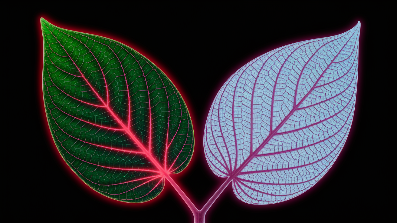
False-color composites take spectral bands your eyes can’t see (especially near-infrared) and translate them into visible colors on a screen. The trick works because healthy plants bounce back a lot of NIR light. Their cell structure scatters that wavelength like crazy, while chlorophyll soaks up visible red for photosynthesis. When you map NIR to the red display channel, red reflectance to green, and green reflectance to blue, invisible plant health suddenly glows bright red.
Healthy vegetation shows up as vivid red in a standard NIR–Red–Green false-color composite. Stressed plants lose that punch and fade toward pale pink, brownish, yellow, or cyan, depending on how much NIR drops and which visible bands hold steady. Water looks dark or black because it absorbs NIR. Bare soil usually reads as tan or light brown. To put numbers on what you’re seeing, you can calculate NDVI (Normalized Difference Vegetation Index): (NIR − Red) / (NIR + Red). NDVI runs from −1 to +1. Values above 0.5 mean healthy, dense vegetation. 0.2 to 0.5 signals moderate vigor, and anything below 0.2 flags sparse cover or exposed soil.
Vegetation stress shows up in false-color imagery for a bunch of reasons:
Drought creates rapid, widespread NDVI decline and fading red tones across entire fields or forests. Pests and disease tend to produce irregular patches of low NDVI and color shifts, often starting at edges or popping up in scattered pockets. Nutrient deficiency causes gradual, uniform desaturation and pale colors across management zones. Waterlogging or flooding leaves dark water signatures and suppressed NIR, pushing NDVI down wherever water stands. Disease outbreaks spread in localized patterns, with color changes creeping outward over time. Irrigation or planting issues create linear, grid-aligned, or row-level anomalies in both color and brightness.
The real power here is early detection. Compare current imagery to historical NDVI curves and baseline color patterns for your field or forest stand. A drop of 0.1 to 0.2 NDVI within a few weeks can flag trouble before you see yield loss or canopy dieback. Always validate suspicious color shifts with field checks, yield data, or soil tests before you act.
Understanding Key Band Combinations for Vegetation Stress Composites
The go-to false-color composite for vegetation stress is NIR–Red–Green. Near-infrared (roughly 0.70 to 1.10 µm) gets displayed as red, the red band (0.63–0.69 µm) as green, and the green band (0.53–0.59 µm) as blue. Healthy vegetation glows bright red because plants reflect tons of NIR and absorb red light. When stress hits, chlorophyll production drops, NIR reflectance weakens, and that red color fades to pink, brown, or greenish tones. Clear water stays dark since it absorbs NIR, and bare soil comes through as tan or light brown depending on moisture and minerals.
For moisture stress and late-season monitoring, you can bring in shortwave infrared bands around 1.6 to 2.2 µm. SWIR reflectance drops when leaf water content declines, so swapping SWIR in place of NIR can catch drought stress earlier. Red-edge bands sit between red and NIR at about 0.70 to 0.75 µm and help detect chlorophyll changes when the standard red band maxes out in dense canopies. These band swaps let you fine-tune detection for specific stress types and crop growth stages.
| Band Combo | Display Mapping | What It Reveals |
|---|---|---|
| NIR, Red, Green | NIR → Red, Red → Green, Green → Blue | Healthy vegetation bright red; stress shows as pale red/brown/yellow; water dark; bare soil tan |
| SWIR, NIR, Green | SWIR → Red, NIR → Green, Green → Blue | Moisture loss and soil/plant stress; healthy vegetation bright green; drought and wilting shift colors |
| NIR, Red-Edge, Green | NIR → Red, Red-Edge → Green, Green → Blue | Late-season chlorophyll and nitrogen status; useful when standard red band saturates in dense crops |
Practical Workflow for Creating and Reading False-Color Composites

Start by grabbing imagery that includes at least NIR and red bands. Check the acquisition date, cloud cover, and spatial resolution. Most platforms offer surface reflectance products that have already been atmospherically corrected, which strips out haze and path radiance that mess with band ratios. Filter your image collection by cloud cover (something like cloud_cover < 30% works), then apply a cloud mask to ditch any remaining cloudy or shadowed pixels before you build your composite. For time-series work, create median or mean composites over a week or month to smooth out transient noise and capture what’s actually typical.
Once you’ve got clean imagery, set visualization parameters for each band. Reflectance values for Landsat or Sentinel sensors typically run from 0 to 1 (or 0 to 10,000 in scaled integer products), and you’ll map that range to display values of 0 to 255 per RGB channel. Narrowing the max parameter (setting NIR max to 0.4 or 0.5, for instance) stretches lower reflectance values and pulls out subtle differences in vegetation. Build your false-color composite by assigning NIR to red, red reflectance to green, and green reflectance to blue, then load the layer into your mapping tool next to a true-color reference.
To analyze the composite in a way that catches real stress signals, follow these steps:
- Load and preprocess imagery. Apply atmospheric correction, filter by cloud cover, mask clouds and shadows, and align images geometrically if you’re comparing multiple dates.
- Create the false-color composite. Map NIR to red display, red to green display, green to blue display, and set min/max scaling (like 0 to 0.5 for NIR).
- Compute vegetation indices. Calculate NDVI using (NIR − Red) / (NIR + Red) and optionally NDMI or NDRE for moisture and chlorophyll.
- Establish baselines. Collect historical mean NDVI and standard deviation for each field or forest stand, or build a seasonal reference curve from prior years.
- Detect anomalies. Flag pixels or zones where NDVI drops more than 0.1 to 0.2 from baseline, or where false-color brightness shifts noticeably toward pale or dark tones.
When you spot suspicious patches, zoom in and compare current false-color brightness with prior dates and NDVI values. An NDVI decline of 0.1 or more within a couple of weeks usually signals real stress, not just normal seasonal change. Cross-check the spatial pattern. Circular pockets suggest disease or pests, linear features point to irrigation or planting problems, and widespread fading indicates drought or nutrient shortfall.
Using NDVI and Complementary Vegetation Indices to Confirm Stress
NDVI translates the color difference you see in false-color composites into a single number. The formula (NIR − Red) / (NIR + Red) gives you values from −1 to +1. Typical thresholds look like this: NDVI below 0.2 means sparse vegetation or bare soil, 0.2 to 0.5 indicates moderate plant cover or stress, and above 0.5 marks healthy, dense canopies. A drop of 0.1 to 0.2 over a short window (two to four weeks) flags emerging stress that might not be obvious on the ground yet. Pair NDVI maps with your false-color composite to confirm that pale red zones line up with low index values and that bright red areas match high NDVI.
For moisture stress, use NDMI (Normalized Difference Moisture Index), which compares NIR and SWIR: (NIR − SWIR) / (NIR + SWIR). When plants lose water, SWIR reflectance climbs and NDMI drops, often before NDVI shows much change. In very dense crops or forests where NDVI saturates near 1.0, switch to EVI (Enhanced Vegetation Index), which includes a blue-band correction and stays sensitive to canopy differences even at high biomass. Each index highlights a different aspect of plant condition, so using two or three together gives you a clearer picture than relying on color alone.
Recognizing Visual Stress Patterns in Agriculture, Forests, and Wetlands
In agricultural fields, stress patterns tell stories about what’s happening below the canopy. Circular or irregular pockets of faded color and low NDVI often mark pest infestations or disease hotspots, especially when the patches grow over successive images. Declines along field edges can mean herbicide drift, soil compaction from equipment, or shading from tree lines. Striping or row-aligned color differences point to planting issues like uneven seed rates, blocked nozzles, or malfunctioning irrigation lines. Widespread, gradual fading across an entire field or region usually means drought, nutrient depletion, or a management practice applied uniformly.
Forests and wetlands show different cues. Dieback from insects or disease appears as scattered brown or pale zones within otherwise bright red canopy, and the pattern spreads outward over weeks. Waterlogged wetlands suppress NIR reflectance where standing water mixes with vegetation, creating darker tones and lower NDVI than surrounding dry forest. Clear-cuts or harvest areas drop to near-zero NDVI and shift to tan or grey in false-color. Regrowth starts as faint red patches that brighten season by season.
Common field-diagnostic patterns include:
Circular low-NDVI pockets likely mean pest or disease infestation spreading from a center point. Edge-zone declines suggest herbicide drift, compaction, or shade effects. Linear or grid-aligned anomalies point to planting gaps, irrigation line failures, or row-level management errors. Widespread uniform decline signals drought, nutrient deficiency, or large-scale environmental stress. Patchy waterlogged zones with dark signatures indicate flooding or drainage problems suppressing NIR.
When you identify a suspicious pattern, prioritize field checks by ranking zones by NDVI drop magnitude and checking whether the pattern matches known causes. Ground-truth the top outliers first, then expand sampling if the cause isn’t immediately clear.
Role of Resolution and Sensor Choice in False-Color Vegetation Assessment
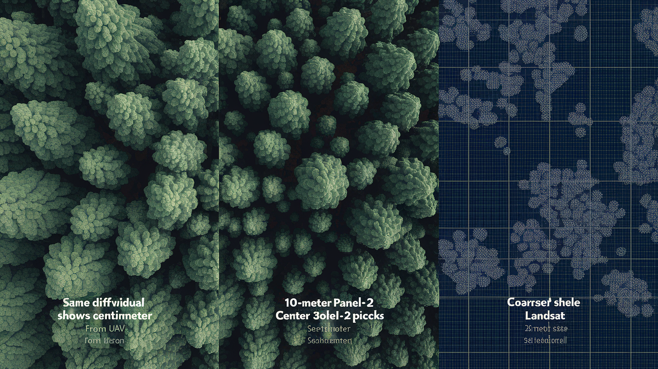
Spatial resolution determines what you can see and what gets mixed into a single pixel. UAV multispectral cameras capture imagery at centimeter to meter scale, letting you spot individual plants, count stressed trees, or map within-row variability in a crop. That detail helps diagnose localized problems like irrigation emitter clogs or small pest colonies before they spread. Sentinel-2 satellites offer 10-meter resolution in visible and NIR bands and revisit the same location roughly every five days with both satellites operating. That makes them ideal for regional crop monitoring and early stress detection across hundreds of fields at once.
Landsat satellites provide 30-meter resolution and a 16-day revisit with a single satellite, but the archive stretches back to the 1980s. You can build long-term NDVI baselines and track decadal changes in forest health or land cover. Temporal resolution matters as much as spatial detail when you’re trying to catch stress early. A daily or weekly image stack lets you pinpoint the exact week when NDVI started dropping, while biweekly or monthly composites smooth out weather noise but may miss rapid disease outbreaks or short drought windows.
| Sensor | Resolution | Revisit | Use Case |
|---|---|---|---|
| UAV Multispectral | Centimeters to ~1 m | On-demand | Field-level diagnostics, precision agriculture, targeted scouting |
| Sentinel-2 | 10 m (visible, NIR) | ~5 days (dual satellite) | Regional crop monitoring, early stress detection, frequent updates |
| Landsat 8/9 | 30 m | 16 days (single sat) | Long-term change analysis, historical baselines, consistent archive |
| PlanetScope | ~3–5 m | Daily to near-daily | High temporal cadence for rapid detection, field-scale monitoring |
Change Detection and Time-Series Techniques for Monitoring Stress Over Time

A single false-color snapshot tells you the current state, but a time series reveals trends, anomalies, and the timing of stress onset. Start by building a seasonal baseline from several years of NDVI data for each field or forest stand. Calculate the mean and standard deviation for every week or dekad (10-day period) of the growing season, then flag any current value that falls more than two standard deviations below the historical mean. An NDVI drop of 0.1 to 0.2 within a couple of weeks often signals the start of stress, especially if the decline continues in the next image.
Anomaly detection methods range from simple thresholding to z-score normalization. A z-score shows how many standard deviations the current NDVI sits from the seasonal average, so you can compare stress severity across different locations or crop types. Negative z-scores below −2 highlight serious outliers worth immediate field inspection. Values between −1 and −2 suggest moderate stress that may stabilize or worsen depending on weather and management response.
To extract and use seasonal trends, try this:
- Collect multi-year imagery for the same location and date range, filtering by cloud cover and quality flags.
- Compute NDVI or other indices for each image, then stack the time series by calendar week or dekad.
- Calculate mean and standard deviation for each time window across all years to build the baseline curve.
- Compare current-year values to the baseline; flag anomalies where NDVI drops significantly or deviates beyond normal variation.
Sudden declines (like a 0.2 NDVI drop in one week) usually point to acute events such as hail, flood, or rapid disease spread. Gradual declines over several weeks suggest chronic stress like progressive drought, slow nutrient depletion, or cumulative pest damage. Interpreting the rate and shape of the decline helps you choose the right intervention, whether that’s emergency irrigation, targeted pesticide application, or longer-term soil amendment.
Advanced Methods: Machine Learning and Object-Based Analysis for Stress Mapping
Supervised classification algorithms (especially random forests) can learn the spectral signatures of healthy versus stressed vegetation from labeled training samples and then classify entire images automatically. You provide examples of stressed and healthy pixels, the model builds decision rules based on NIR, red, SWIR, and derived indices, and it outputs a stress map with predicted classes. Random forests handle noisy data well and can incorporate texture features, elevation, and temporal metrics alongside spectral bands, which improves accuracy when stress patterns are subtle or mixed with other land covers.
Deep learning models (particularly convolutional neural networks or CNNs) go further by detecting spatial patterns and context. A CNN trained on false-color composites can recognize the shape and arrangement of stressed patches, not just the pixel values. That helps separate disease clusters from isolated management errors or natural variability. These models require more training data and computing power, but they’re especially useful for large-scale operational monitoring where manual interpretation isn’t practical.
Object-Based vs Pixel-Based Interpretation
Object-based image analysis (OBIA) segments the image into homogeneous patches (individual fields, forest stands, or canopy clusters) before classification. Instead of assigning each pixel independently, OBIA computes statistics (mean NDVI, texture, shape) for each segment and classifies the whole object. This approach reduces mixed-pixel errors at field edges, smooths out noise, and aligns results with real management units like farm parcels or forest compartments. Segmentation also lets you track stress at the object level over time, making it easier to build field-specific stress histories and link spectral patterns to yield records or silvicultural treatments.
Ground Truthing and Accuracy Assessment for Vegetation Stress Maps
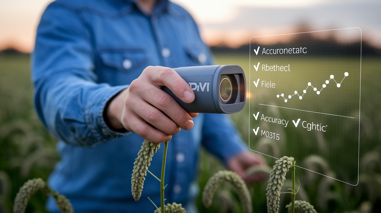
Field sampling validates whether your false-color interpretations and stress classifications match reality on the ground. Visit a stratified random sample of pixels or segments flagged as stressed, healthy, or transitional, and record actual plant condition, NDVI measurements from a handheld sensor, soil moisture, pest presence, and any management actions. Collect enough samples to represent different crop types, soil zones, and stress levels. Aim for at least 30 to 50 points per class if you can swing it.
Accuracy assessment quantifies how often your map agrees with ground truth. Build a confusion matrix comparing predicted stress classes to field observations, then calculate overall accuracy, producer’s accuracy (how many true stress cases you caught), and user’s accuracy (how many of your stress predictions were correct). Kappa coefficients adjust for chance agreement and provide a single summary statistic, though reviewing the full confusion matrix shows which classes get confused and where errors cluster.
Common accuracy measures include:
Overall accuracy is the percentage of all samples correctly classified. Producer’s accuracy tells you, for each class, the fraction of ground-truth samples correctly identified (1 − omission error). User’s accuracy shows, for each class, the fraction of map predictions that match ground truth (1 − commission error). Kappa coefficient measures agreement adjusted for random chance, ranging from 0 (no better than random) to 1 (perfect agreement).
Repeat validation each season or whenever you change sensors, preprocessing methods, or stress thresholds. Accuracy can drift as crop varieties, planting dates, and weather patterns shift, so periodic ground checks keep your maps reliable and your management decisions sound.
Final Words
We walked through how NIR→R false-color composites make healthy vegetation show bright red, how NDVI thresholds flag decline, and which band combos and workflows help confirm stress.
We covered time-series change detection, sensor choice, machine learning options, and why on-the-ground checks are essential. Compare current imagery to baselines and watch for a >0.1 NDVI drop as an early warning.
Practicing reading false-color composites to identify vegetation stress helps. You’ll spot issues early and target fixes faster. Good tools, good timing, better outcomes.
FAQ
Q: What is a false-color composite and how does NIR help reveal vegetation vigor?
A: A false-color composite is an image that maps near-infrared (NIR) into the red channel so plant vigor shows as bright red. NIR highlights leaf structure and helps separate healthy from stressed vegetation.
Q: How do healthy and stressed vegetation appear in NIR–Red–Green false-color images?
A: Healthy vegetation appears bright red in NIR→R false-color; stressed plants shift toward pale red, brown, yellow, or cyan. Water looks dark and bare soil shows tan, so contrast helps diagnosis.
Q: What NDVI values indicate healthy, moderate, or sparse vegetation?
A: NDVI values indicate vegetation density: NDVI = (NIR − Red) / (NIR + Red). Values >0.5 are typically healthy, 0.2–0.5 moderate, and <0.2 indicate sparse cover or bare ground.
Q: What band combinations best detect vegetation stress, and when should I use SWIR or red-edge bands?
A: The NIR-Red-Green (NIR→R, Red→G, Green→B) combo is standard for vigor. Use SWIR to reveal moisture loss and red-edge to detect late-season chlorophyll stress when the red band saturates.
Q: What is a simple workflow to create and read false-color composites and detect stress?
A: A simple workflow starts with atmospheric correction and cloud masking, then make an NIR→R composite, compute NDVI, compare to historical baseline, and flag areas with NDVI drops >0.1 for field check.
Q: Which indices complement NDVI to confirm moisture stress or dense canopy issues?
A: NDMI (NIR − SWIR) tracks moisture loss and pairs with SWIR bands. EVI helps where NDVI saturates in dense canopies. Use these indices alongside NDVI to pinpoint stress causes.
Q: What visual patterns point to pests, irrigation issues, drought, or waterlogging?
A: Circular low-NDVI pockets suggest pests or disease; edge declines hint at drift or compaction; striping points to planting or irrigation problems; widespread decline signals drought; suppressed NIR means waterlogging.
Q: How does sensor choice and resolution affect detecting vegetation stress?
A: Sensor choice matters: UAVs give centimeter detail for small plots, Sentinel-2 provides 10 m resolution with ~5-day revisit, and Landsat offers 30 m with 16-day revisit for long-term comparisons.
Q: How can time-series analysis confirm stress and which thresholds or methods help?
A: Time-series confirms trends by comparing current NDVI to seasonal baselines. An NDVI drop >0.1–0.2 signals stress; standardized anomalies or z-scores beyond ±2 standard deviations highlight unusual declines.
Q: When should I use machine learning or object-based methods for stress mapping?
A: Use random forest for multispectral classification, CNNs for spatial pattern recognition, and object-based segmentation to reduce mixed-pixel errors. They’re useful when patterns are complex or datasets are large.
Q: How important is ground truthing and which accuracy metrics should I use?
A: Ground truthing is essential: field samples validate spectral flags. Assess accuracy with a confusion matrix and metrics like overall accuracy, producer and user accuracy, and the F1 score, sampling across management zones.